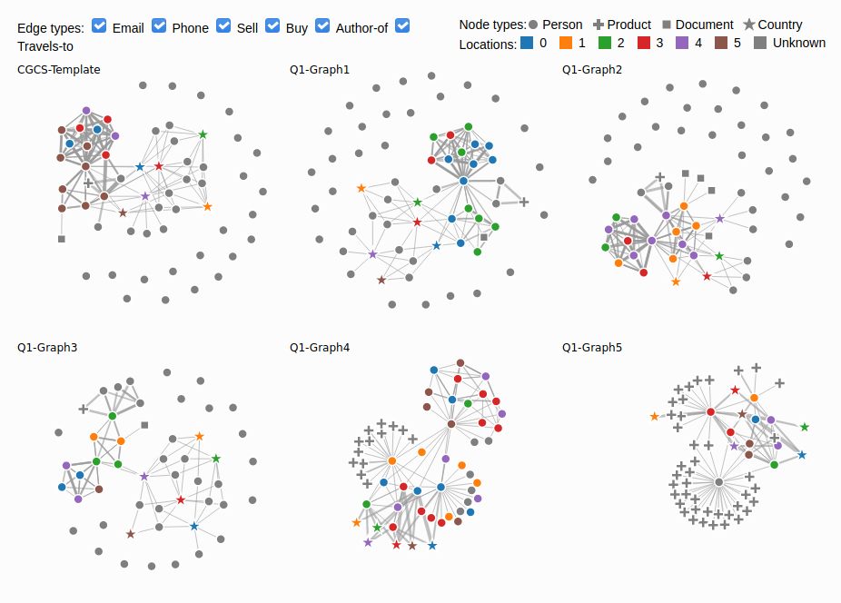
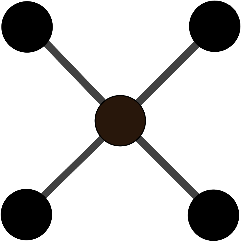
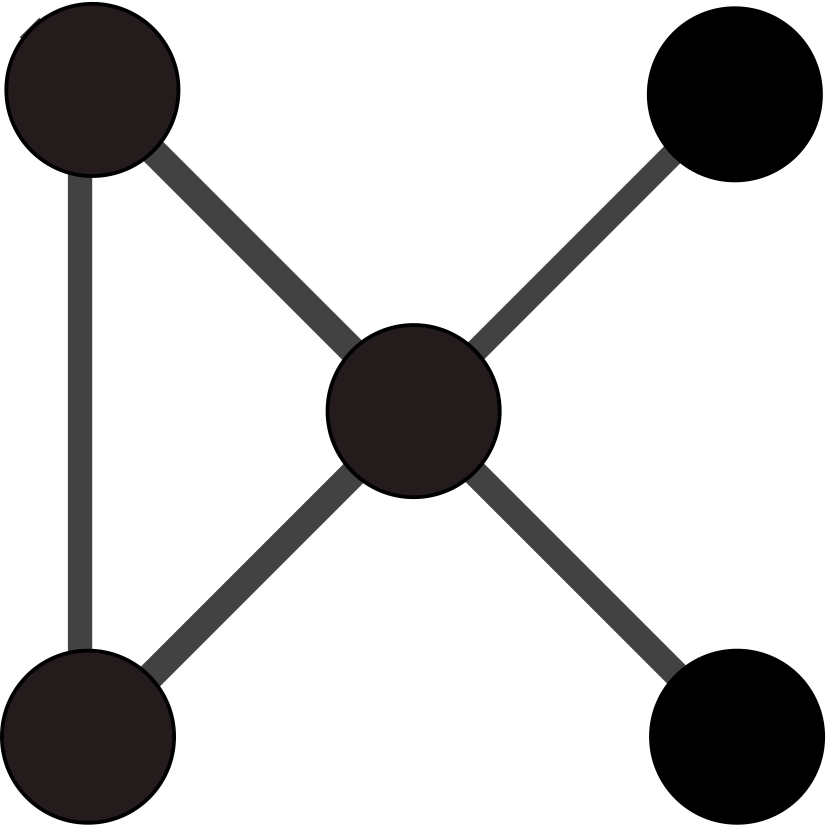
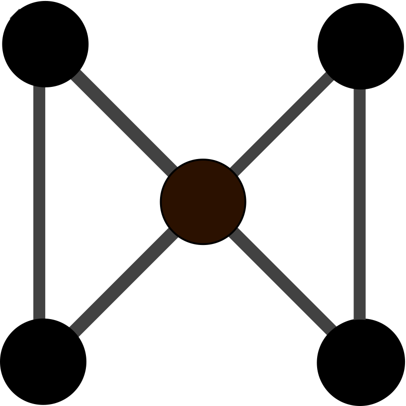
Figure 1: Node-link views for the template graph (top-left) and the five candidate
graphs
Natkamon Tovanich, IRT SystemX and Université Paris-Saclay, CNRS, Inria, LRI, natkamon.tovanich@inria.fr PRIMARY
Alexis Pister, Université Paris-Saclay, CNRS, Inria, LRI, alexis.pister@inria.fr
Gaëlle Richer, Université Paris-Saclay, CNRS, Inria, LRI, gaelle.richer@inria.fr
Paola Valdivia, I3, CNRS, Telecom Paris, Institut Polytechnique de Paris, paola.valdivia@inria.fr
Jean-Daniel Fekete, Université Paris-Saclay, CNRS, Inria, LRI, jean-daniel.fekete@inria.fr
Christophe Prieur, I3, CNRS, Telecom Paris, Institut Polytechnique de Paris, christophe.prieur@telecom-paristech.fr
Petra Isenberg, Université Paris-Saclay, CNRS, Inria, LRI, petra.isenberg@inria.fr
Student Team: NO
Tools Used:
Data preprocessing:
Visualization:
Approximately how many hours were spent working on this submission in total?
350 hours in total for 7 people over 8 weeks
May we post your submission in the Visual Analytics Benchmark Repository after VAST Challenge 2020 is complete?
YES
Video
The video is included in this submission package at /video/VastChallenge2020-MC1-Tovanich-Final.wmv or download here.
The source codes are also included in this submission package and can also be accessed from the GitHub repository.
The project webpage can be found in this link.
Center for Global Cyber Strategy (CGCS) researchers have used the data donated by the white hat groups to create anonymized profiles of the groups.One such profile has been identified by CGCS sociopsychologists as most likely to resemble the structure of the group who accidentally caused this internet outage. You have been asked to examine CGCS records and identify those groups who most closely resemble the identified profile
Questions
1 –– Using visual analytics, compare the template subgraph with the potential matches provided. Show where the two graphs agree and disagree. Use your tool to answer the following questions:
Question 1a - Answer:
To compare the template graph and the candidate graphs, we created a tool to visualize all node and edge types (except the demographics channel) on juxtaposed node-link views, with color indicating the inferred location for person nodes. Figure 1 shows that Graphs 4 and 5 have a very different structure with a focus on products and a denser connection of people. While being noticeably sparser than the template, Graph 3 remains one of our candidates together with Graph 1 and 2.
Figure 1: Node-link views for the template graph (top-left) and the five candidate
graphs
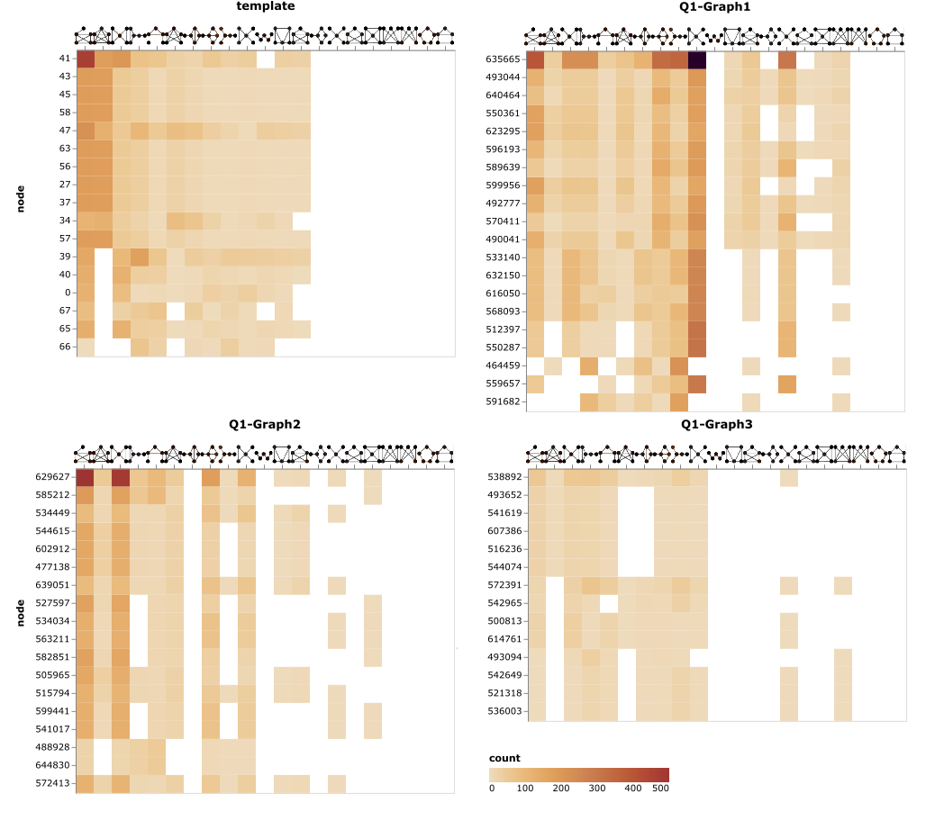
We conducted an analysis of the structure of the communication channels by calculating graphlets on the phone and email edges. Graphlets are “small connected non-isomorphic induced subgraphs of a large network” that help understand local structural similarities beyond just counting edges. We used 5-node graphlets as 4-node graphlets cannot capture complex connectivities and 6-node graphlets are too numerous to compare.
Figure 2: Heatmap of graphlet signatures for the communication channels for the template graph and candidate graphs 1, 2 and 3. 5-node graphlets are ordered the same for all graphs while nodes are sorted by Eigenvector centrality per graph.
In Figure 2 we can see that the most common graphlet patterns of the template are the clique , indicating dense communication within the group, and the clique-minus-three , connecting the dense group with an outside node. Graph 1 has more star-like and star-plus-one-edge graphlets, indicating a connection between two separate groups. Graph 2 tends to have clique-minus-three and bow-tie graphlets , indicating a bridge connecting two groups. Graph 3 doesn’t show any strong graphlet patterns since the communication network is sparse. We conclude that Graph 2 has the most similar communication pattern compared to the template.
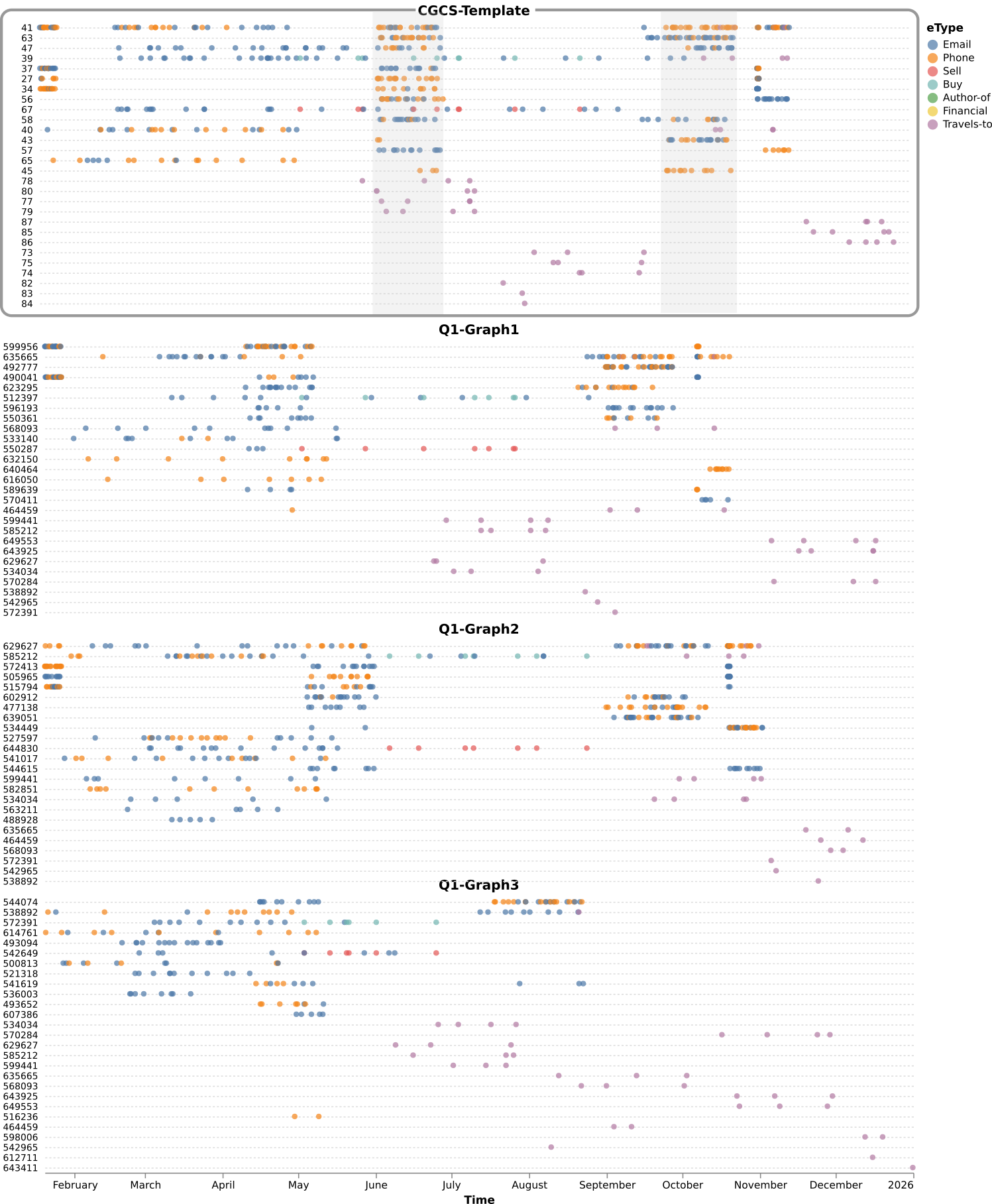
Figure 3 shows the temporal activities for the template and the three remaining candidate graphs. Again Graph 3 seems the most dissimilar. The template graph has two peaks of communication during June-July and October-November. Both Graphs 1 and 2 also have two peaks but at different times. Graph 2 again seems to be closest to the template which we further confirmed with the metrics we report in the next question. [499 words, 3 figures]
Figure 3 Temporal activity for the template and graph 1, 2 and 3. Edge types are encoded by color and people sorted by their number of activities (edges)
[496 word, 3 images]
Question 1b - Answer:
Two features helped us to determine the similarities between the template and candidate graphs: (a) communication network graphlets and (b) the temporal profile of each graph.
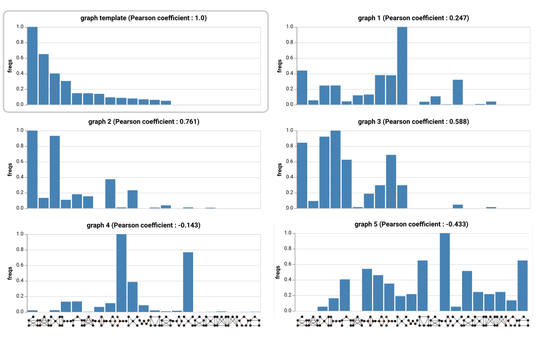
Figure 4: Normalized graphlet frequencies of the template and candidate graphs with Pearson’s correlation coefficients.
We computed graphlet frequencies inside the template and the five candidate graphs, for the 21 undirected 5-node graphlets, on the communication channels. Figure 4 displays the normalized frequencies ordered by decreasing frequencies for the template. Graph 2 is the most structurally similar candidate to the template graph, with a Pearson's correlation coefficient of 0.761, followed by Graph 3 with a correlation of 0.588. Graph 2 and the template share the same most frequent graphlet.
We plotted aggregated temporal events by counting the number of edges with temporal information for each day (Figure 5). The most similar candidates were Graph 1 and 2. Even though none of these graphs present an activity peak in the middle of the year, Graph 1 and 2 both have an increase of phone calls and emails, then a high peak and some more activity followed by only travels (in green). However the peak activity from Graph 2 is closer in size to the one of the template graph.
Figure 5: Temporal series counting the number of edges with temporal information for each day.
Using dynamic time warping distance (DTW), we calculated the pairwise distance of the aggregated time series between all graphs and built the hierarchical clustering shown in Figure 6.
Figure 6: Hierarchical clustering of time series with DTW distance
In summary, we conclude that Graph 2 is the most similar to the template graph.
[296 words, 3 images]
2- CGCS has a set of “seed” IDs that may be members of other potential networks that could have been involved. Take a look at the very large graph. Can you determine if those IDs lead to other networks that matche the template? Describe your process and findings in no more than ten images and 500 words.
Question 2- Answer
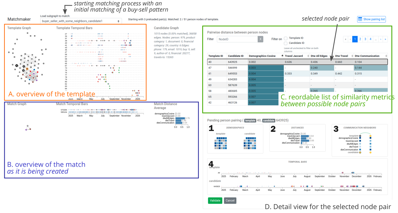
We applied similarity measures to the large graph to help us answer both Questions 3 and 2 in this order. Originally, we had derived our similarity measures to find answers to Question 1 as well but were not successful (see this node matching views). The similarity measures we tried are:
Demographic similarity: We use the cosine similarity metric to calculate the similarity of demographic profiles between person nodes in the template graph and in the large graph.
Travel similarity: For travel edges, we created tuples of trips (source location, target location) and appended them to a set of trips for each person. We calculated the Jaccard similarity coefficient of trips made.
Graphlet-frequencies similarity: We computed a similarity based on the difference of the graphlet frequencies between the template and big graph nodes.
We implemented a greedy matching algorithm to crawl the large graph from the seed nodes. We used phone and email edges to crawl the nodes as they directly connect people together. We joined different similarity measures and tried: (1) Demographics and Travel, (2) Graphlets, (3) Demographics, Travel and Graphlets
We induced the subgraph by extracting all communication edges between these matching persons as well as the other edge types.
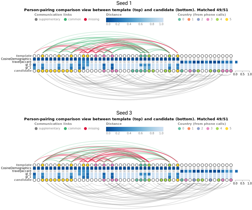
Figure 7: template graph and closest matches from Seed 1 and 3.
We tried several similarity measures, and the setting (1) gave the best match. We used only the template nodes which had either demographics or travel information (49 persons of the 51). Figure 8 shows the matched nodes for Seed 1 and 3. We see that the similarities between the matched nodes are very high, meaning that the matched nodes have very similar demographic and travel profiles. Moreover, we can see that a lot of the communication edges are retrieved (green arcs), even if some connections differ. Figure 9 shows the temporal series of the two graphs and the template.
Figure 8: Visualization of node matches in the template (circles on the top) and candidate nodes from the big graph (circles on the bottom). One column stands for a pair of matched nodes and the squares between them show the distances for demographics, travel, graphlets on email, and graphlets on phone calls using a sequential color scale. Differences and similarities between edges are encoded in the arc color.
Figure 9: Temporal series of the template and the extracted subgraphs from seed 1 and 3.
The person node in Seed 2 did not have any connections with others. So it did not lead to other person nodes to match with the template.
[499 words, 4 images]
3- Optional: Take a look at the very large graph. Can you find other subgraphs that match the template provided?
Question 3 Answer
When working on Question 1 we noticed a special pattern in the template graph: seller (67) - product - buyer (39). Seller and buyer communicated via email, and made 9 transactions for the products of the same category (Figure 9). Also, the buyer travelled to different places after the last email with the seller.
Figure 10: Ego network of node 39 showing all edges that have 39 as a target and all edges that have 39 as a source.
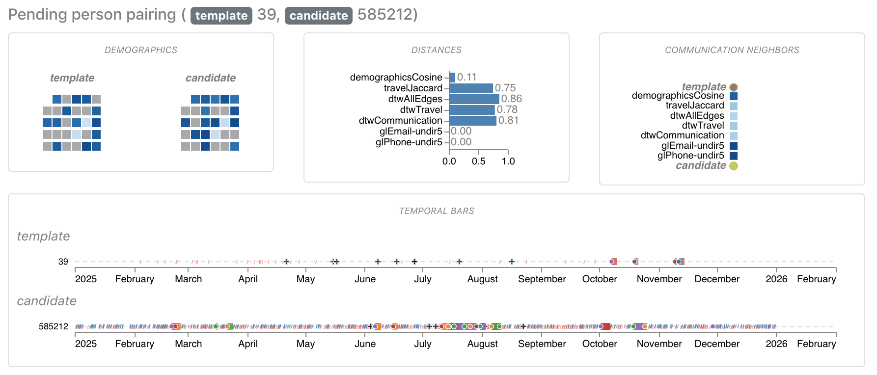
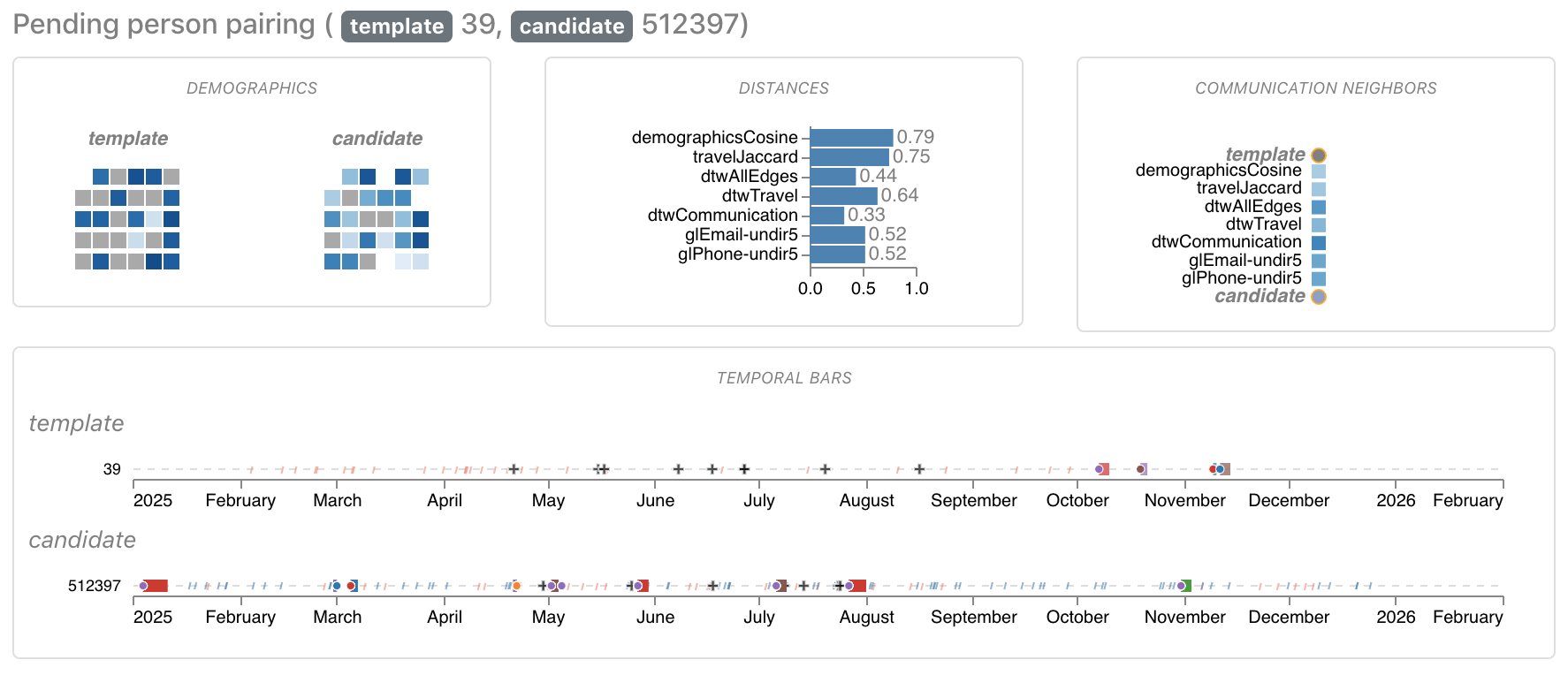
We used this pattern to search the large graph for trios of seller - product - buyer. We focused on the 3 trios that had more than 7 occurrences. We extracted 3 candidate subgraphs around the buyer in each trio including all their travels, sent or received phone calls or emails, and their financial information. We visualized these candidates in our matching tool (Figures 11, 12 and 13) to compare the profile from the buyer of the template with the buyer of the extracted candidate subgraph.
Figure 11: Comparison between Node 39 from the template and Node 585212 from the extracted graph.
Figure 12: Comparison between Node 39 from the template and Node 512397 from the extracted graph.
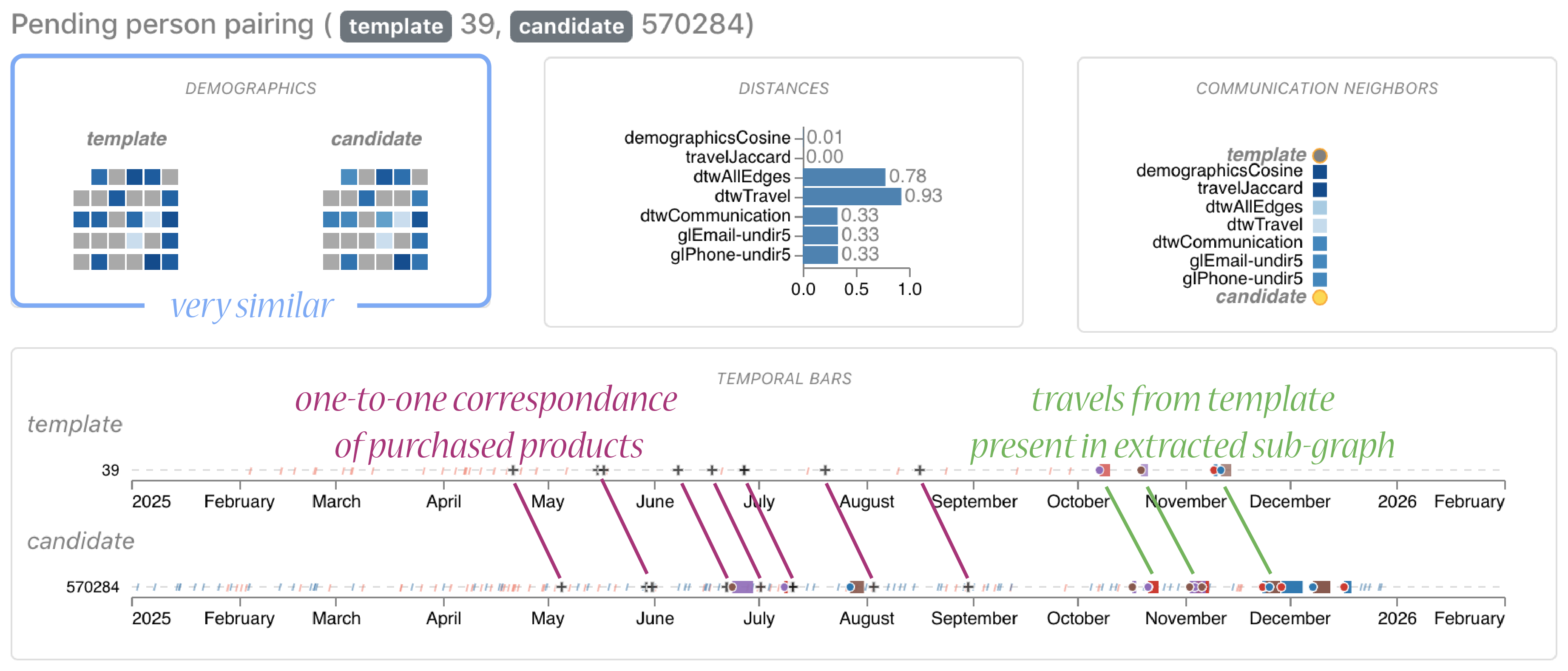
Figure 13: Comparison between Node 39 from the template and Node 570284 from the extracted graph.
The first two candidates did not match well (Figures 11 and 12) but there was a good match in the third candidate (Figure 13): We saw a one-to-one correspondence of the 9 purchased products with an exact shift of 14 days. Also, their demographics profile was very similar, in fact, the values of the template were a rounded version of the values of the large graph. And, the travels from the template graph were present in the extracted subgraph, again with a shift of 14 days.
Next, we extracted the list of persons whose rounded demographic profile was the most similar to the nodes in the template. We found an exact match for 36 nodes (middle of Figure 13).
Figure 14: Template graph (left), extracted subgraph (middle) and final match (right)
Since we noticed that the travels were a partial match for the seller (Figure 12), we searched matches on the large graph using the travel start and duration, with a shift of 14 days. We found 15 nodes whose travels were a superset of the travels of nodes in the template graph. After this, the node with id 66 in the template was still unmatched. Since we knew that it received emails from Node 39, we searched all nodes that received an email from Node 570284 (the match of 39), and filtered by time to find the node that matched 66. Then, we had all the 51 people in the template graph matched (Figures 14, 15 and 16).
Figure 15: Visualization of the temporal activity in the template (top) and the final match (bottom); top graph corrected with a shift of 14 days.
Figure 16: Visualization of the edges matched between the template graph and the final match.
[500 words, 7 images]
4 –– Based on your answers to the question above, identify the group of people that you think is responsible for the outage. What is your rationale? Please limit your response to 5 images and 300 words.
Question 4 Answer
Figure 17: Node-link views for the template graph with all edges (left), phone and email edges (middle), and travel-to edges (right).
Using the match in Question 3, we created a network with all edges from unconnected nodes. The network has 47 people (Figure 17, left) connected mostly by phone, email and travel-to channels. We observe that people from the dense communication group in Figure 14 communicated less frequently with people outside of it (Figure 17, middle). We guess that they know each other from traveling to the same place due to overlapped trips in Figure 18.
Figure 18: The timeline chart shows each person traveling to countries. The bar and dot colors indicate the target and source location, respectively.
We may detect the group that is responsible for the outage from the temporal activities. Interestingly, there is a peak of communication frequencies between November 11-12 with a total of 17 emails and 7 calls among 8 people (Figure 19). This happened after there was no communication for 7 days (Figure 20). We suspect that something wrong happened between November 4-10 and that leads to a high exchange of emails and phone calls in the two following days.
Figure 19: Temporal series counting the number of edges with the suspicious subgraph.
Figure 20: Visualization of the temporal activity per hour in the suspicious subgraph between October and December.
We then explored the communication between people before and after the event (Figure 21). We suspect that the outage took place between November 4-11, and that the 12 people [477769,519424,546999,551810,568093,572500,581406,612711,615605,636990,638752,649553] that communicated 2 days before and after are responsible for it.
Figure 21: Visualization of the email (top) and phone edges (bottom) for each person. Edges are represented as vertical lines. Dots in orange and blue represent source and target nodes, respectively.
[300 words, 5 images]
Question 5 - Answer
The large graph size was challenging for several reasons. The graphlet calculations cost us the most amount of time and were the most challenging to complete on the big graph for the following reasons:
Sampling graphs from the big graph and computing the graphlet frequencies on those sugraphs
were computationally intensive. We had to use special virtual machines with high resources for a couple of
days to do the computations.
What would have helped?: More
computers, more CPU, or a parallel processing implementation would have allowed for faster
computations.
In addition to the graphlet challenges, we found it difficult to find the right
similarity measures/channels to use, especially since what worked for Question 1 was different from what
helped us to find the solution to Questions 2 and 3. Our challenges specific to similarity matching were: